

The Role of White Space in UI Design
When you open an app or visit a website, what catches your eye first? The colors, the buttons, or the layout? While these elements are important, there’s a hidden hero in user interface (UI) design that often goes unnoticed—white space. Also known as “negative space,” white space is the empty area between elements like text, images, and icons. It’s not just “empty” space; it’s a powerful tool that shapes how users interact with digital platforms.
Whether you’re a designer, a startup founder, or a student curious about design trends, understanding white space is crucial to staying ahead. As the world moves toward clean, user-friendly interfaces, white space has become a universal principle in modern UI design. In this blog, we’ll explore its role, why it’s a global standard, and how it can improve digital experiences for users everywhere—while keeping you inspired by the latest trends.
What Is White Space in UI Design?
- Macro White Space: The larger gaps between major sections, like the space between a navigation bar and the main content or between columns in a layout.
- Micro White Space: The smaller gaps, such as the spacing between lines of text, buttons, or menu items.
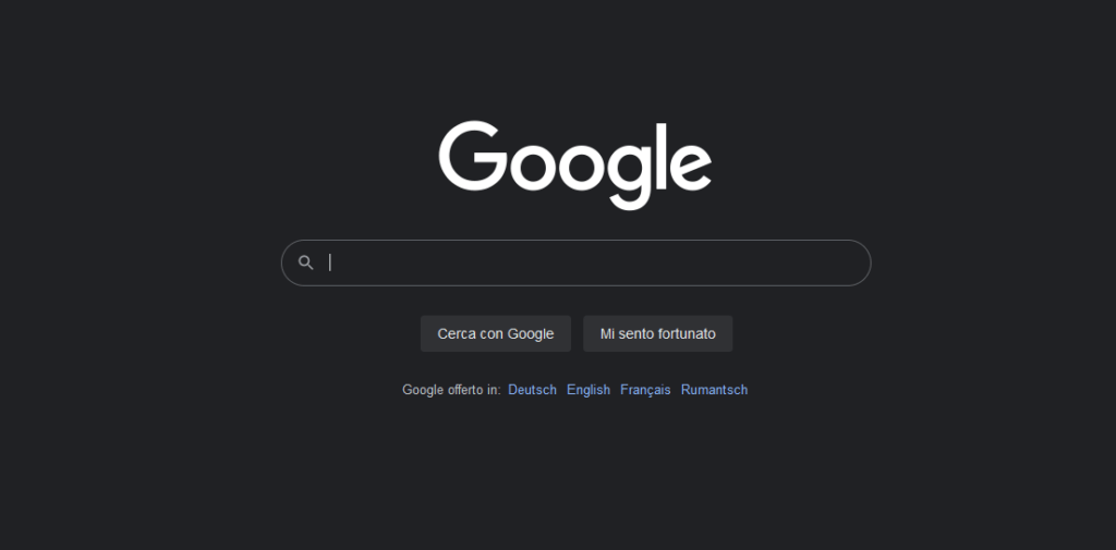
Take the Google homepage, for instance. In the image I’ve included in examples, you’ll notice a clean, open layout with a search bar centered perfectly. That’s white space in action—guiding your focus effortlessly. This principle is used by top global brands, from Apple to Spotify, and it’s reshaping how we design for the digital age.
Why White Space Matters in UI Design
UI design is becoming simpler and more user-friendly, and white space is a big part of this change. Every day, billions of people use apps and websites on their phones, tablets, and computers. Designers are now focusing on making interfaces clean, easy to understand, and free of clutter. This is why white space is so important in modern UI design:
1. Boosts Readability and Comprehension
2. Sharpens User Focus
3. Reduces Cognitive Overload
4. Elevates Perceived Value
Ever noticed how luxury brands like Rolex or Tesla use expansive white space? It screams elegance and quality. Globally, this trend signals professionalism, something Indian businesses can leverage to compete on the world stage.
5. Enhances Accessibility
With inclusivity as a global priority, white space improves legibility and contrast, benefiting users with visual impairments or those on small screens. Apps like Notion follow this standard, ensuring accessibility for all—a must-know for Indian designers targeting diverse audiences.
White Space in Action: Global Examples
Let’s explore how white space shines in real-world UI designs from around the globe:
1. Google Search
Google’s homepage is a perfect example of minimalism. It uses a lot of white space to keep the design simple and direct all your attention to one thing—the search bar. This clean approach makes it easy for anyone to use, no matter where they are in the world. Whether you’re searching for information, images, or videos, the empty space around the search bar helps you focus without distractions. It’s a design that works for everyone, everywhere.
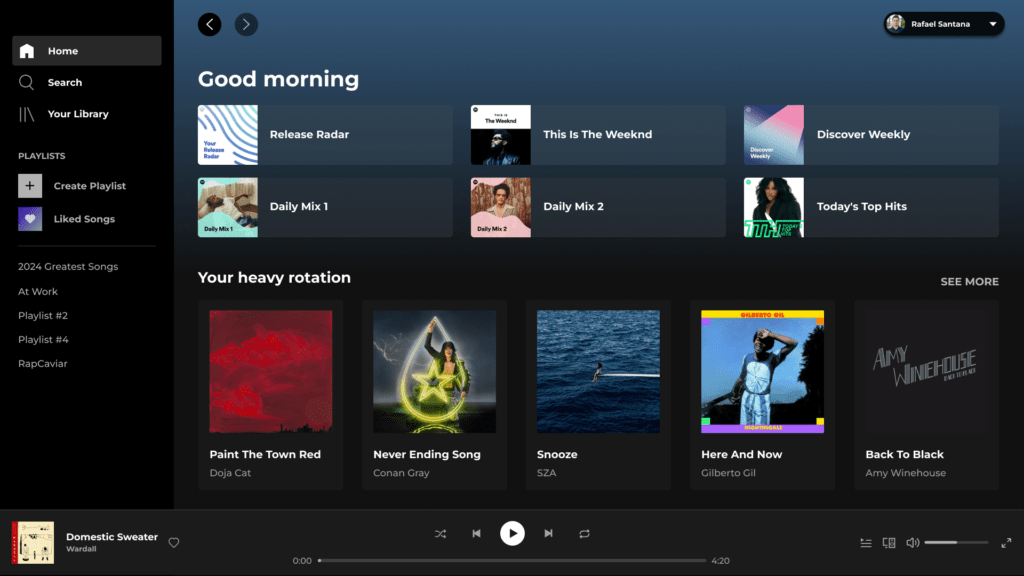
2. Spotify
In Spotify’s app, playlists and album covers are neatly organized with plenty of white space in between. This global music streaming platform uses white space to make browsing and discovering music feel smooth and visually pleasing. The empty areas help your eyes focus on what matters—like your favorite playlists or new recommendations—without feeling overwhelmed. It’s a design that makes exploring music simple and enjoyable for everyone.
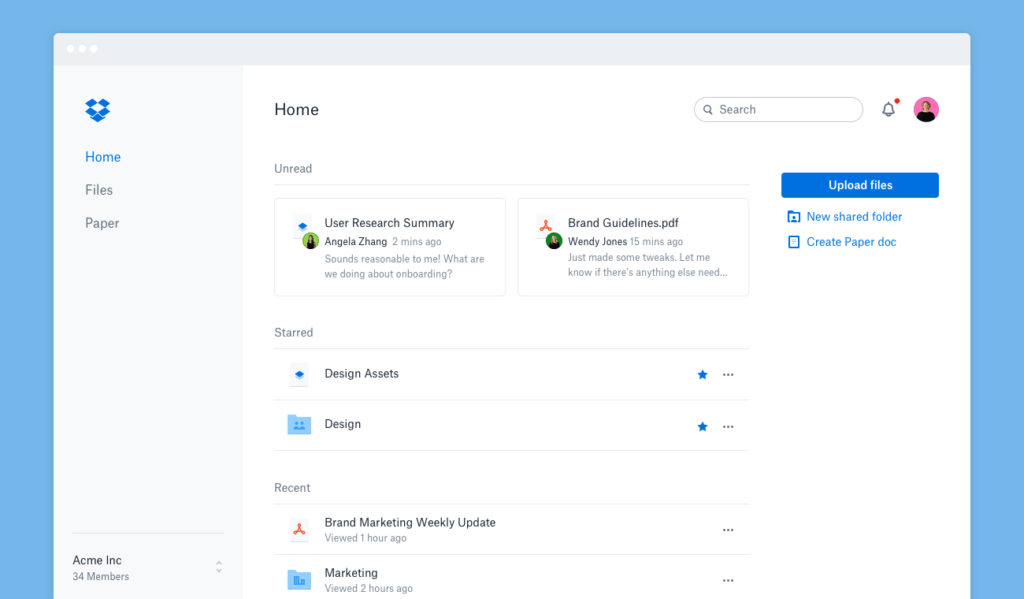
3. Dropbox
Dropbox, a popular productivity tool used globally, relies on white space to keep its interface clean and organized. Files and folders are neatly arranged with plenty of empty space around them, making it easy to navigate and find what you need. This clutter-free design improves usability and helps users stay focused. It’s a great example for startups everywhere, showing how simplicity can enhance user experience.
How Much White Space Is Enough?
- User Expectations: Tech-savvy millennials worldwide prefer airy, minimalist layouts, while some audiences favor denser designs. Testing with users is key.
- Device Diversity: From iPhones to budget Androids, white space must adapt to varying screen sizes—a challenge Indian designers face daily.
- Content Goals: An e-commerce site like Amazon uses moderate white space to showcase products, while a meditation app like Calm opts for more to evoke serenity.
White Space and Global UI Trends
As an Indian reader, you’re likely eager to align with worldwide design movements. White
space fits seamlessly into today’s global UI trends:
- Minimalism: Born in Silicon Valley and embraced everywhere, minimalism uses white space to strip away excess, focusing on what matters. Think Apple’s iOS or Google’s Material Design.
- Dark Mode: A global hit (seen in Instagram and YouTube), dark mode swaps white space for “black space,” keeping the same principles of clarity and focus.
- Microinteractions: Subtle animations—like a button hover effect—pair beautifully
with white space, as seen in designs by companies like Slack.
Tips for Using White Space Effectively
For designers or businesses aiming for global standards, here’s how to use white space effectively:
- Create Visual Hierarchy: Use larger white spaces (macro) to separate big sections like headers and footers, and smaller white spaces (micro) for details like padding and margins. This helps users navigate your design easily.
- Design for Touch: Since mobile-first design is now a global standard, make sure buttons and links have enough space around them for easy tapping. Follow guidelines like Apple’s 48px touch target size to ensure usability.
- Combine with Typography: Pair white space with clean, simple fonts like Roboto or Helvetica. This improves readability and makes your design look polished and professional.
- Test Across Audiences: Designs that work in one region might not work in another. Use tools like Figma and conduct user testing to adapt your design for different audiences.
- Adapt for Dark Mode: With dark mode becoming popular (like on YouTube or PhonePe), white space turns into “black space.” The same principles apply—keep the design clean and focused for clarity.
- Balance Content and Space: Avoid overcrowding your design. Use white space to give your content room to breathe, making it easier for users to focus and engage with what’s important.
As internet speeds improve globally, faster load times will enable richer and more detailed visuals. In this scenario, white space will become even more essential to keep interfaces clean, organized, and user-friendly.